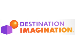
 NHICC (New Hampshire’s Incredible Creativity Connection), or NH-DI as you know it, are happy to announce the new logo being used by the international non-profit Destination ImagiNation.
Below is the press release by Destination Imagination:
We have updated our logo as part of an ongoing evolution of our overall brand. The former logo was used for more than 11 years and represents two very different styles of thinking. The box is a symbol of developers—thinkers that prefer structure when exploring novel ideas, think inside the proverbial box, and enjoy conforming to existing expectations and procedures. The ball has come to be a symbol of explorers—thinkers that find structure limiting, think outside the proverbial box, and choose not to conform to existing expectations and procedures. The convergence of the two represents flexible thinkers who can move between both styles.
The new work emerged over the last year as we evaluated the brand though participant surveys, affiliate surveys and focus group testing. We extend our thanks to everyone who participated and helped along the way. Your feedback is appreciated.
In addition to the logo update, DI has restructured the organization’s brand architecture, simplified the messaging and created a more modern visual identity. We will unveil a series of enhancements to the website and print campaign in the fall. These changes will allow our organization to be more clearly understood and better compete in the educational market.
“The refreshed look of our brand identity and corresponding materials demonstrate to all of our customers that we’re a forward-thinking organization with a passion for teaching the creative process” said Chuck Cadle, CEO of Destination Imagination.
The new logo is more than just a visual update with a fresh look — it is the beginning of many great things to come for our organization.
